
I4 Insights
overview

Tension
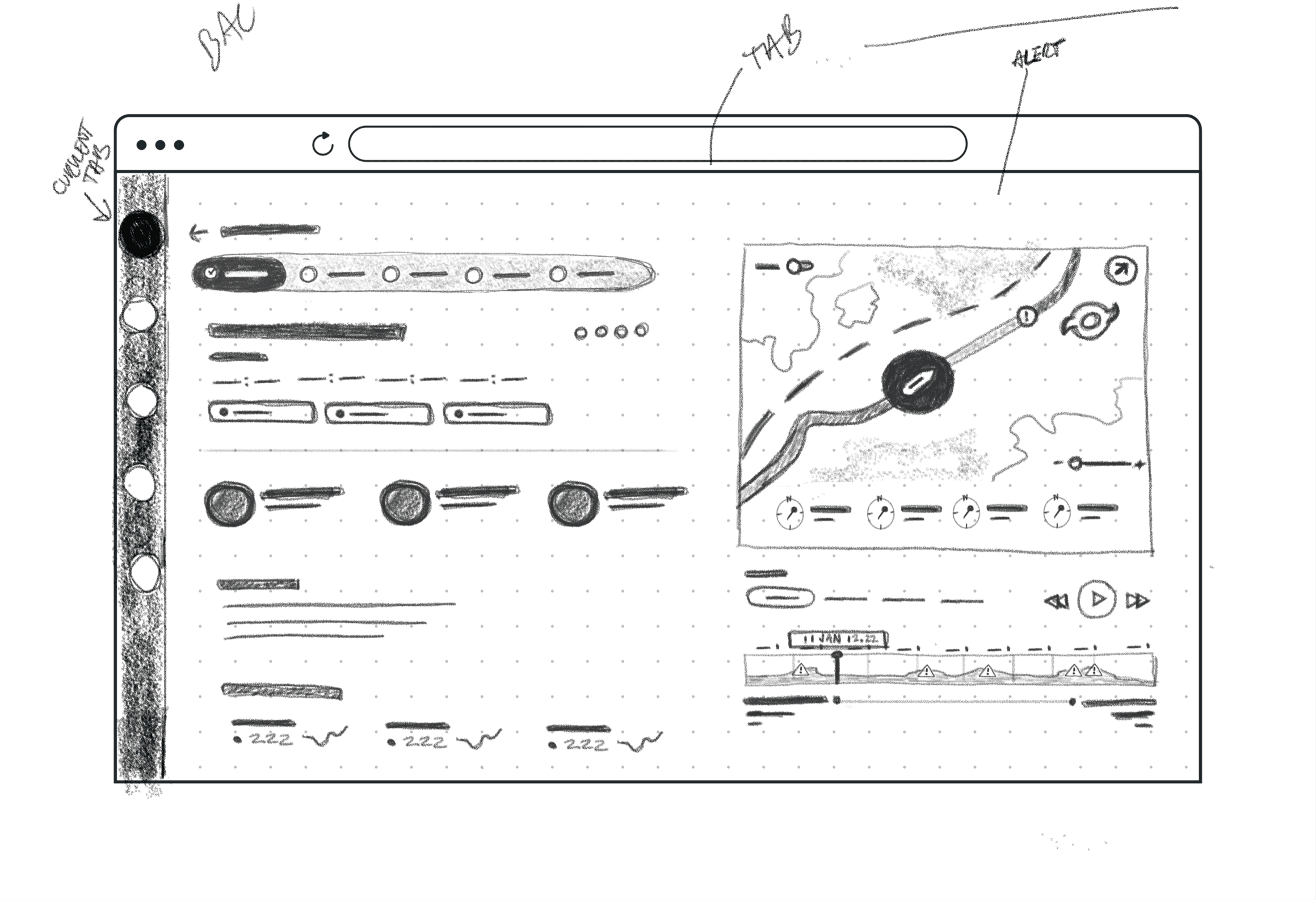
The maritime industry faced a critical mismatch: operators needed constant access to performance and environmental data, but it was splintered across disconnected Power BI dashboards. Operators were forced to toggle between multiple pages to cross-reference data which in turn slowed decision making and created friction in high-pressure moments.
Approach
We consolidated scattered data into a unified hub with an integrated map and list view, refined alert system, and cohesive design system. This transformed the experience from reactive dashboard monitoring to proactive decision making, supporting complex workflows like route simulation and cost optimization with readily available essential data.
Key Roles
Lead Product Designer: Myself
Creative Director: Dhruv Chanchani
Product Manager: Mark Fordice
Product Designer: Jonathan Laing
research


findings
The real problem wasn't just fragmentation, it was hierarchy. Operators don't need all their data at once. They need different information at different moments of their workflow.
At a glance
Which vessels need attention?
Geospatial Context
Where are we in the world? What's the shipping infrastructure?
Monitoring
What's the current state and what's breaking?
Deep Investigation:
Why is this vessel off course? What data supports this decision?
key idea
The ideal experience surfaces exactly the right information at each layer, giving operators instant answers while keeping deeper context one click away.

design approach
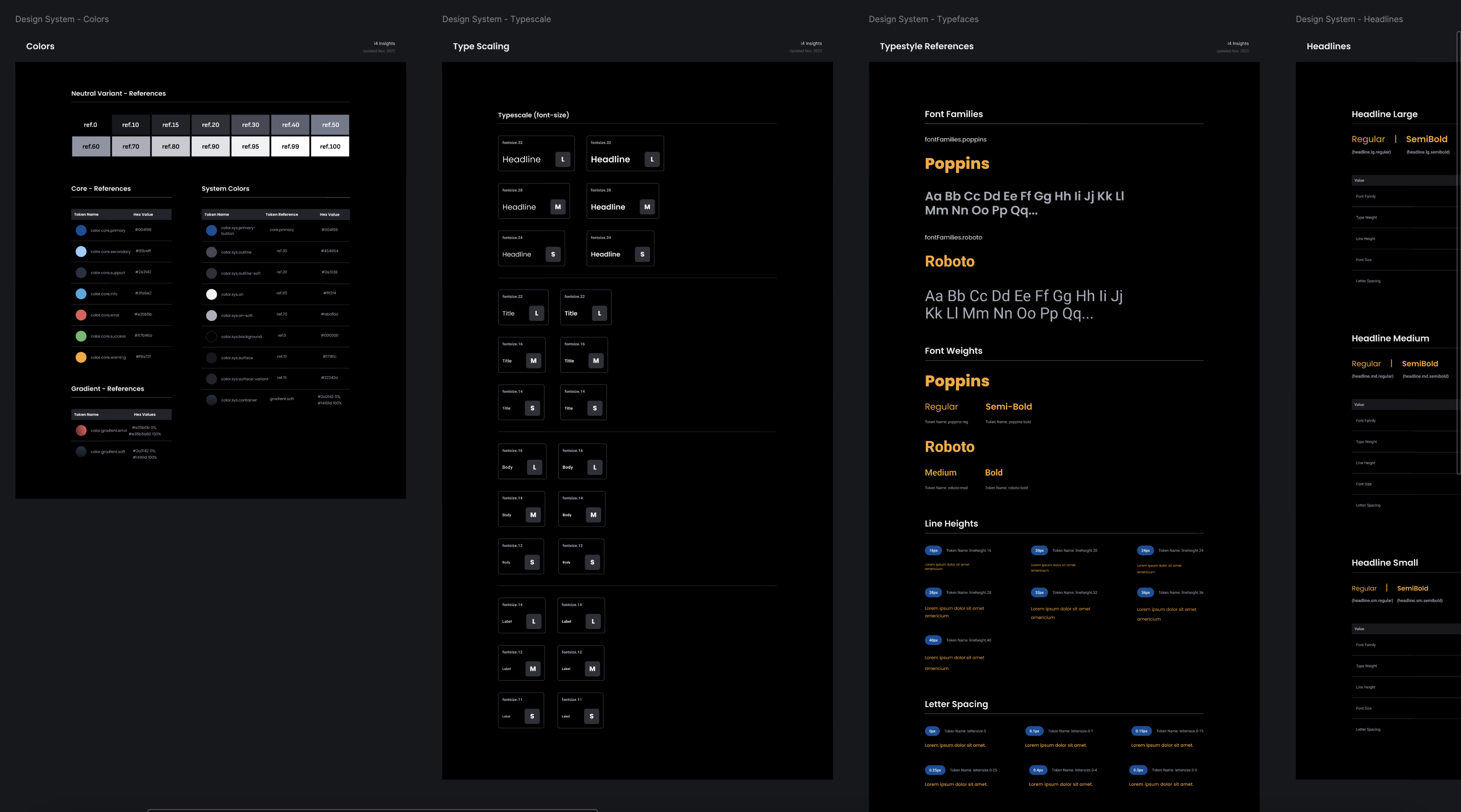
design system and component library
quick recap
Operators needed anticipation, not just reporting. We designed for scenario planning and what-ifs rather than passive data display.
Ruthless prioritization shaped every layer. The hub surfaced categories, cards showed alerts, details showed everything. Nothing cluttered the view unless it earned its place.
Consistency across scales was non-negotiable. The same card patterns, alert language, and interactions meant operators could shift between overview and detail without relearning the interface.
The map was the foundation, not a feature. It grounded every other layer in geographic reality and connected everything together.
This project tought me an essential lesson…
We pushed the visual experience hard per the team's request, but I learned something important. When a client wants to shoot for the moon, you need to ensure the rocket is built properly first. Showing an end state vision without an iterative path means you might never actually ship.
Part of that is understanding the developer side. I was focused on design vision without fully grasping their tech constraints. There could have been a working product using their existing stack that wasn't as slick but actually existed. Since then, I've prioritized understanding their databases, frameworks, and organizational maturity before designing. It keeps my work ambitious but buildable, not a pipe dream.
stills gallery


